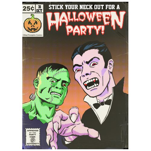
So, having spent far more time than I planned on creating endless layers of shapes I kept the colour scheme fairly simple. I tried halftoning all the areas but this just looked messy so I stuck to the background, the faces and the hand.

Monday 25 October 2010
Sunday 24 October 2010
Frankenstein and Dracula Vector Ink
Because I wanted to create a piece of vector art I attempted to use the Pen Tool to ink in the sketch. The main drawback? I took frickin' ages! This being in part because of a lack of knowledge with regard to using Pen Tool. Mistakenly I created close to a hundred layers, and with each layer containing a single shape I found it extremely frustrating to locate and alter a particular area.
What I didn't realise is that you can use the Path Selection Tool (the dark arrow in the toolbox) which will select entire shapes, then Ctrl+C and Ctrl+V the selection into another shape layer. When you paste you will notice in the tool bar that the Combine button will become active and clicking this will join the shapes into one shape. You can also make negative joins which is very useful to cut bits out existing shapes.
As for the picture I found it was a bit dull, so I added the hand coming at the viewer to give it some drama. I also I tried to vary the line weights to mimic the kind of brush inking style that used to be popular in pulp comics.
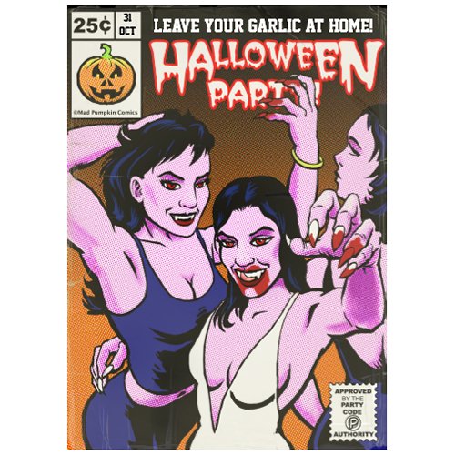
Another Halloween Design
I'm sort of cheating here as I did this one before the other female vampires design and it features a couple of classic horror characters. However I learnt a lot from doing this one first, mainly around the use of the Pen tool in PS
As per usual I sketched out the idea using a standard hard round brush with a dual brush setting to give it a pencil like texture. The original plan was to do a painted pulp magazine type cover, but then I decided to go for a Roy Lichenstein pop art design. Here's the sketch
As per usual I sketched out the idea using a standard hard round brush with a dual brush setting to give it a pencil like texture. The original plan was to do a painted pulp magazine type cover, but then I decided to go for a Roy Lichenstein pop art design. Here's the sketch
Friday 22 October 2010
The Finished Halloween Invitation!
Now comes the colour. I won't go into a great deal of detail as it's pretty straightforward for anyone who uses Photoshop. What I have found is useful is to create a layer of just flat colour using the Lasso Tool and Paint Bucket and duplicate this into a safe area so that when if comes to either shading or applying filter effects you can just use the magic wand tool to select the area you want to alter.
With the classic comic idea in mind I used the photoshop filter Pixelate -> Color Halftone to give it that comic/pop art look of the little dots. You have to play around with the settings until you get the effect your looking for.
I added the comic logo (based loosely upon the Marvel comic logo) and a spoof of the Comics Code logo that was prevalent around the 70's.
As an after thought give it a slightly vintage look, as if it were an old and well read comic book, I added a layer of old paper scanned in and used a layer mask to just reveal enough to "age" the drawing.
Halloween Design Inking Process
This he next step is to "ink" it in. This involves a standard photoshop brush - hard round I believe - with a dual brush setting to give it some texture, and a setting of 85% opacity. Once the inking is completed I find it best to duplicate the layer and combine (Ctrl-E) to increase the line weight and then mess about with the brightness/constrast to get the most constrast possible.
Also where I really need to smooth the lines out I use the pen tool to create a shape over the ink drawing, then rasterize the shape and combine into the drawing layer.
Halloween Invitation Design Initial Sketch
With Halloween around the corner I thought of creating and selling a party invitation for sale on Zazzle. I had a thought to show some female vampires in a sexy pose, but also trying to retain some menace in the design. I drew in black using a hard round brush with a dual brush setting to give a bit of texture on a 75% opacity setting. I think it's quite close to a behaving like a pencil. During the drawing I duplicate the layer and then merge (Ctrl-E) to clean up the drawing and make the lines nice and heavy.
I like to convert the grayscale drawing to blue to make it easier to "ink". The easiest way I have found to convert a greyscale line drawing to a colour is to make a copy of one of the channels (I usually use the blue channel). Then on a new layer use the Select -> Load Selection and select the Channel : Blue Copy. Click the Invert box. What you see is the "walking ants" outline of the original drawing which can now be filled in using the Paint Bucket Tool (set to 100% opacity) with the colour of your choice.
Subscribe to:
Posts (Atom)